
WeblyStudio specialises in tailor made digital media. They collaborate as 6 specialised agencies, creating websites, apps, content and everything else that contributes and connects.
There is no shortage of characters here at WeblyStdudio. In order to highlight unique impressions of each agency through beer labels, we had to investigate deeper into what truly shapes the personality of each agency. Identifying these traits and transforming them into visual forms is what ultimately shapes the outcome of a design.
Much like creating digital media, brewing craft beer takes a straightforward process and a whole lot of creativity.
Having a client’s perspective is very important in the way we work. When I’m designing for a client I like to take a look around their workplace to get inspired. It’s vital to my process to really get a feel for the company I’m working for. Luckily there was little travel time involved with this particular project, as we are all under the same roof.


WeblyStudio focuses on accelerating innovation within corporates. They are always ahead of time, living in the future. This label design reflects their loop of constant optimisation and contains elements of robotic beer brewing
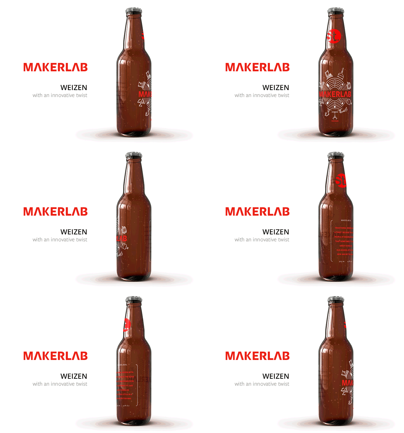
Keywords: innovative, product development, futuristic
Weizen is a traditional German wheat beer according to the Reinheitsgebot. It states that beer may only contain malted barley, water and hops. So in order to stand out you have to get very innovative with those ingredients. Innovative use of the tools at hand is exactly where MakerLab excels.

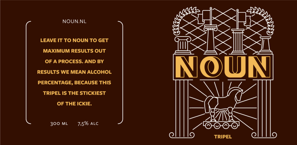
The product owners of NOUN are agile strategists and tacticians who claim to do anything for maximum value and result. Instead of going for obvious symbolisms of strategy I decided to incorporate the Trojan horse, one of the greatest tactical moves in history, to represent them.

The tripel holds the highest alcoholpercentage out of the set. You could say it achieved the maximum results from the beer brewing process. The perfect beer for NOUN, since they only accept the best possible results from their processes.
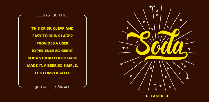
The digital interaction designers at Soda Studio create refreshing user experiences that really pop. They are a young and vibrant team of conceptually strong designers focused on wire-framing, prototyping and laying the groundwork for visual designers. I went for a fresh design using straight lines, arrows and geometric shapes to reference their way of working.

Lager is easy to drink, not too heavy, appropriate for a weekend out on the town but also after a long day at the office. While drinking a few too many specialty beers can quickly lead to headache and regret, the user experience with this lager is a smooth one.
No pixel goes unnoticed at Resoluut, the design agency where I go to work with a smile every single day. They translate strategy into living experiences, making perfectly crafted packaging, websites and apps. I used solid shapes and complete visuals to tell their story of versatile design, music (the volume is usually way up in the office) and art.

Although blond beer contains less hop than other beers, it doesn’t compromise on flavour. ‘Less is more’ is a famous design principle that also applies to this beer.

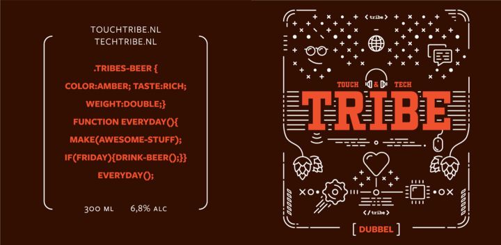
The people who transform images into working pieces of art. They develop digital products; from websites and apps to central managing systems and network solutions. Members of the Tribes are people with a great sense of humour who came from all over the world to work together. This label represents their nerdiness and playful attitude through quirky visuals while their technical brilliance shines through the hardware-like shapes.
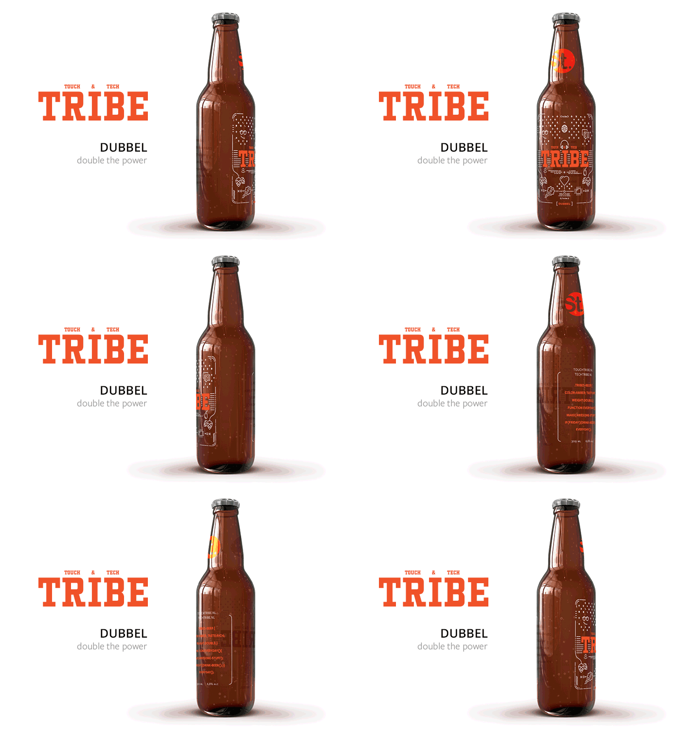
Double the company, double the power so a dubbel beer was the obvious choice. The language on the back of this label might seem foreign to some but makes perfect sense to any Tribe guru.
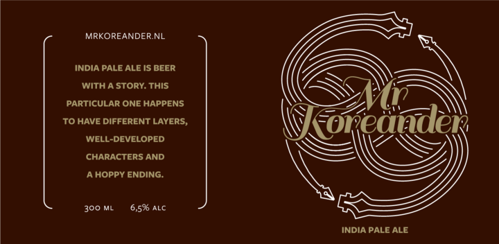
Language and story is their craft. Mister Koreander tells brand stories through creative editorial concepts . For their own brand they took inspiration from The Neverending Story. Using the symbolism of the book and incorporating their logo, I created the label.

India Pale Ale is beer with a great story. Originally, the beer was made by the English to take on long sea voyages to India. Telling stories is where Mister Koreander excels and with terms like ‘developed characters’, ‘different layers’ and ‘a hoppy ending’ we nod to the good old art of storytelling.
We are a specialised design agency based in Pakistan. We focus on creating products that people love to use with the best interaction design. We make sure the product looks as awesome as it works and it’s branding is on par. Want to know more or work with us? Contact us at.
support@weblystudio.com
Fill out the form below and we will get back to you within the next 24
hours to complete the order, and then you’re all set to get started!